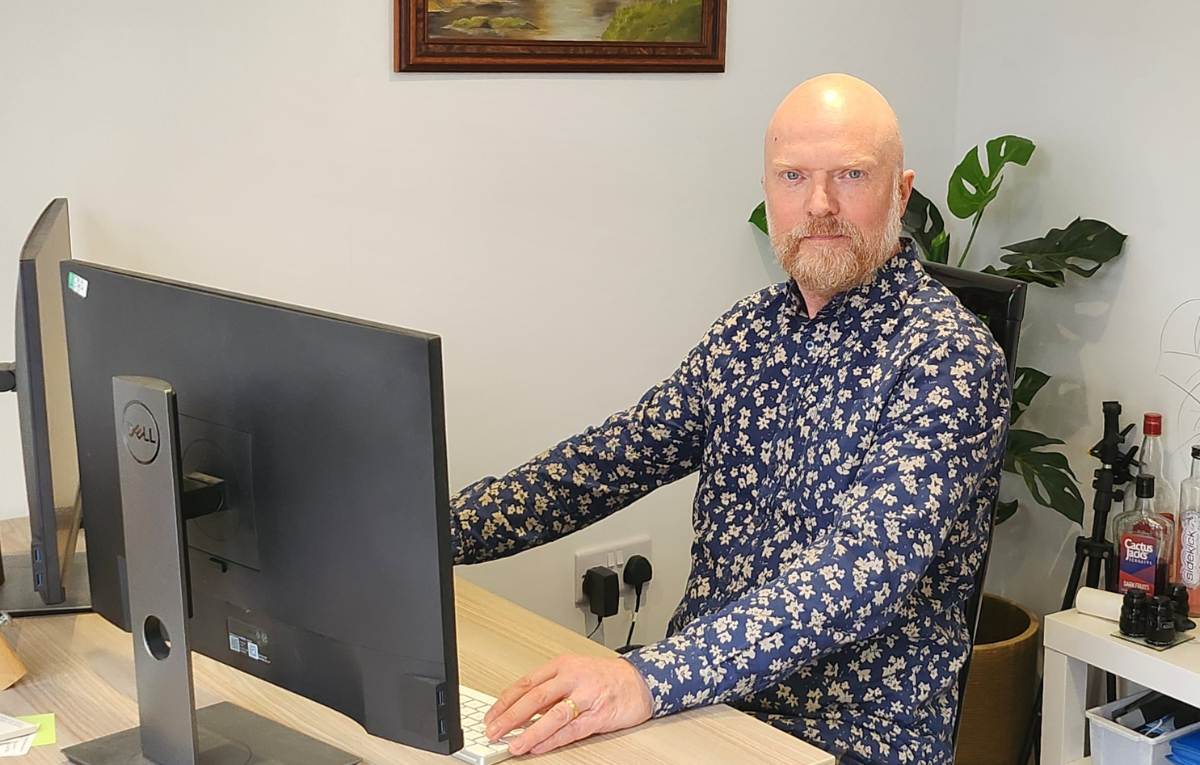
Behind The Teams with Leigh Saunders
Welcome to our new blog series ‘Behind The Teams’ where we sit down with a member of staff to discuss their role and department, celebrate their work and look back on memories!
For this ‘Behind The Teams’ piece, we spoke to one of our Brand Management Operators, Leigh Saunders, to learn more about Brand Management, the work his role entails, and challenges he may typically face.
Leigh has worked at Springfield for over 30 years, so first, let’s get into his thoughts on brand management, and how it has changed in that time!
To you, what is Brand Management and how have you seen it develop over the years?
Brand management is an umbrella term which has increasingly been used to encapsulate each element of reprographics for around the last decade.
Over the years, I have seen the software applications used to create artwork, make files print-ready and manage the consistency and quality of artwork improve greatly.
In my opinion, the biggest improvement that has come about in recent years was the M.I.S. (Management Information System). Once the production and management tools can exchange data with each other, then higher levels of quality can be achieved.
Another big change is that now there are also software tools that large, brand-aware customers use which link into our own system at Springfield. This means that we can now offer greater consistency and quality on a large scale to these global brands in a more streamlined way.
Consistency can be achieved for images, colours, and file layouts regardless of which printer or package type is required. The setup at Springfield offers a fantastic Brand Management service.
Brand Management in Action
I have been the main associate running the Veet account since 2012. For each project, we receive a brand guideline. We will then get a core selection of the new project designs. We also get samples of the different colour variants and imagery. There are usually 3 or 4 variants (i.e., Normal, Sensitive, Dry and Supreme Essence).
Then, the work begins! I will create around 40 packs of all different shapes, sizes, and flavours. All matching approved colours, imagery, and text.
We will also be provided with Master Pack Copy. This is the text required for each specific pack. Some packs are set up as 2, 3 or even 4 language packs.
Once these are all approved, the language rollouts start. This is when all associates join in and change the master text to the various languages required for each market whether it be Germany, the USA, or Brazil.
Can you share any specific challenges or successes you’ve had while working in your role?
As always, there are tight deadlines and plenty of issues that need to be solved. For example, printer’s limitations and too much content that won’t fit on certain packs.
One example of a printer’s limitation may affect text. The job may have minimum size text or minimum thickness of text elements. To get around this, I set the masters up with generous spacing where possible. Then, when the language adaptation gets set up, we can use up the spacing.
If this still doesn’t fit; I show the remaining text on the side of the job. I then send this for feedback where some text may be removed, or other alterations may be undertaken. Currently, projects also use a condensed font which has allowed the required text a good chance to fit.
Another example may be a printer that has specific requirements of tone values for the printing plates of their specific print process. Especially Gravure or Flexo plate printing. These often require maximum tonal values under 300%, No dots under 2% (among other things). For this, we use Esko Pilot software to show us these areas. We then address these in the relevant application.
Are you looking for a brand management solution to help bring your packaging concepts to reality and ensure consistent branding across products? Get in touch!

