Designing for Effect: The Role of Colour in Packaging Artwork

In the fiercely competitive world of Fast-Moving Consumer Goods (FMCG), first impressions are crucial. Which is why the role of colour in packaging artwork is so important.
Did you know that 85% of consumers’ buying decisions are influenced by colour?
This staggering statistic underscores the vital role colour plays in packaging design. For brand owners, brand managers, and marketers, understanding the nuances of colour can be the difference between a product that flies off the shelves and one that gets overlooked.
This blog delves into the psychological impact of colour, its influence on brand identity and purchasing decisions, current trends, and practical guidelines for effective colour use in packaging.
The Psychological Impact of Colour in Packaging Artwork
Understanding Colour Psychology
Colour psychology studies how hues affect human behaviour and decision-making. In the context of product packaging, the right colour can portray a range of messages.
From creating an emotional connection, suggesting sustainable values, stimulating appetite, or convey safety and trust.
Emotional and Cognitive Responses
Different colours evoke various emotions and reactions.
For example, red is known to increase heart rates and create a sense of urgency, making it a popular choice for clearance sales. Blue, on the other hand, evokes calmness and reliability, often used in products that aim to build consumer trust.
Case Studies
Some popular brands who utilise colour to their advantage in packaging are Coca-Cola and Cadbury.
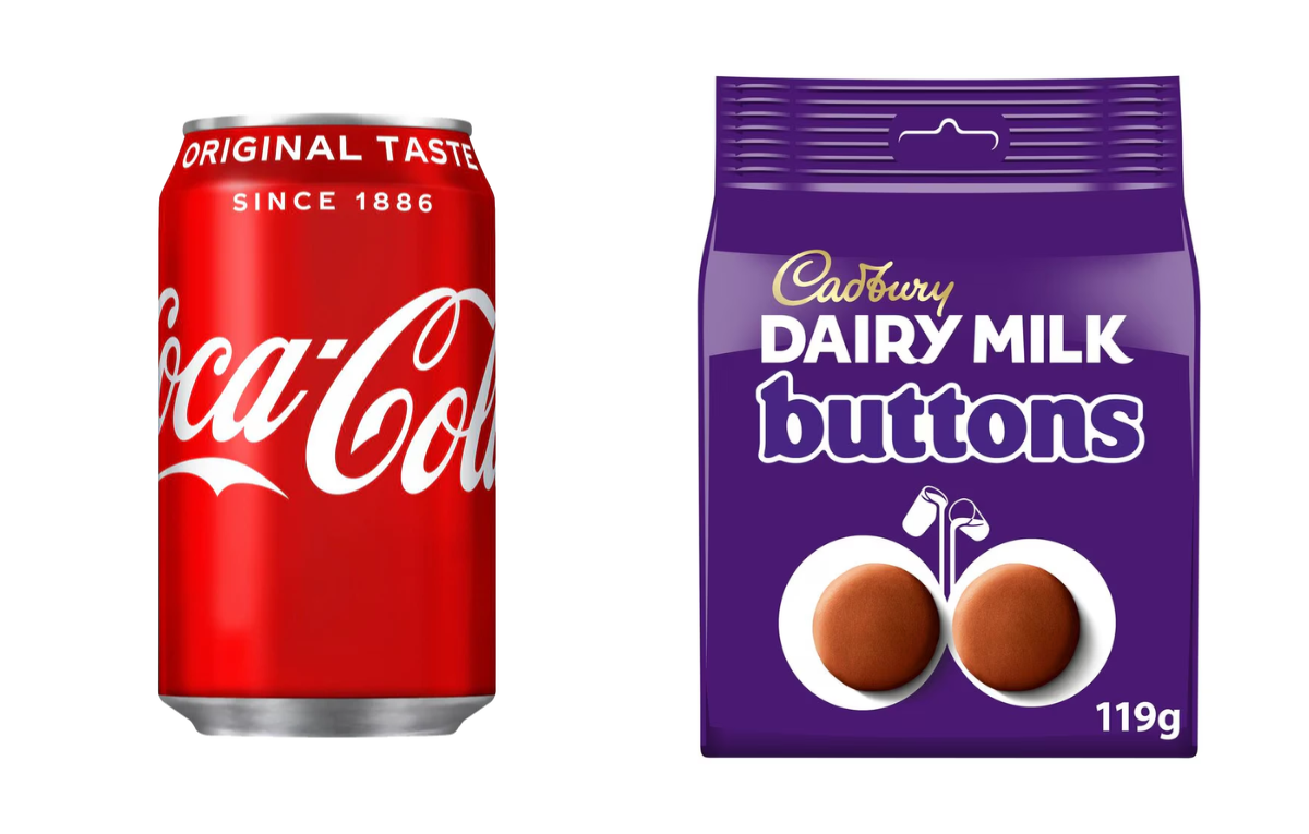
Source: Coca-Cola and Cadburys
Consider Coca-Cola’s iconic red packaging, which exudes energy and excitement, perfectly aligning with its brand identity. On the flip side, Cadbury’s use of purple conveys luxury and indulgence, helping it stand out in the chocolate market.
Both brands are so synonymous with their colour choices, that consumers would be able to identify the brands without any other cues!
Colour and Brand Identity
Building Brand Recognition
Consistent use of specific colours helps build a strong brand identity. It ensures that consumers can instantly recognise your products, even in a crowded marketplace.
Colour as a Brand Signature
Colours can become synonymous with a brand. Think of Tiffany’s blue, which instantly evokes thoughts of elegance and sophistication. Such strong colour associations can enhance brand recall and loyalty.
Consumers may even see that colour elsewhere and think of your brand!
Global Considerations
However, colour perceptions can vary significantly across cultures.
For instance, white is associated with purity and peace in Western cultures but can signify mourning in some Eastern cultures. Global brands must consider these variations to avoid cultural faux pas.
The Influence of Colour on Purchasing Decisions
First Impressions
A consumer typically makes a judgment about a product within the first 90 seconds of seeing it, and up to 90% of that assessment is based on colour alone. Hence, choosing the right colour is critical to capturing attention.
Colour and Perceived Value
Colours also influence how consumers perceive the value of a product. Premium brands often use darker, richer colours like black and gold to convey luxury, whereas bright and vibrant colours are used for more affordable, fun products.
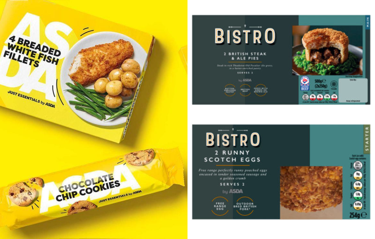
Source: Asda
For example, Asda’s packaging follows this format perfectly. Their ‘Essentials’ range, which is an affordable choice for customers, utilises a bright yellow pack that stands out. Whereas their newest ‘Bistro’ range utilises dark colours with elements of gold foiling to convey a more high-end feel.
In a crowded retail environment, the right colour choice can make your product stand out.
Trends and Innovations in Packaging Colours
Current Trends
Currently, there is a shift towards minimalist designs with muted colour palettes, reflecting a growing consumer preference for simplicity and transparency.
Additionally, pastel colours are becoming popular, especially in categories like wellness and beauty.
Sustainability and Colour
Eco-friendly packaging is on the rise, and with it comes the use of natural, earthy tones like greens and browns. As mentioned earlier, these colours not only appeal to environmentally conscious consumers but also communicate a brand’s commitment to sustainability.
Practical Guidelines for Use of Effective Colour in Packaging Artwork
Choosing the Right Palette
Select colours that align with your brand values and resonate with your target audience. Tools like colour wheels and palettes can help in making informed choices.
Consult your design agency and reprographics provider when selecting colours for your packaging to ensure it will not only convey the correct message to your customer, but look visually appealing when printed.
Testing and Feedback
Before finalising your packaging, conduct consumer testing to gather feedback on colour preferences and perceptions.
This step can help you avoid costly mistakes and ensure your colour choices are well-received.
This could also include the production of packaging mock-ups and prototypes to ensure that you are happy with the printed result.
Balancing Creativity and Consistency
While it’s important to be creative, maintaining consistency in colour usage across all your products and marketing materials is crucial for brand recognition. Strive for a balance that allows for innovation without compromising brand identity.
Colour management is essential to ensure that the colour of your packaging is consistent across substrates, products and printers.
In summary, the role of colour in packaging artwork is multifaceted and immensely powerful.
From influencing emotional responses and building brand identity to impacting purchasing decisions, colour is a critical element in your packaging strategy. For brand owners, managers, and marketers, investing time and resources in understanding and effectively utilising colour can significantly enhance market presence and drive sales.
Utilise a Brand Management partner to consult on your packaging project from concept to design to print to ensure that you speak to your consumers in the correct way through product packaging.