The Art of Colour Consistency
The art of colour consistency – wow, where do we start?
For a long time, we at Springfield have worked relentlessly towards a world where colour is consistent across all our client’s ranges.
How? By bringing a lot of different factors together and combining a flexible workforce that has years of experience. As a brand management team, we work with our clients, their designers and printers to make sure that we’re all on the same page.
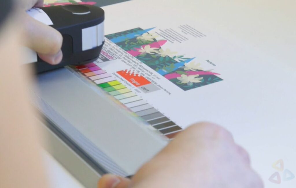
There are a lot of different factors to take into account when we talk about colour management. They can range from different material formats to different inks to different print processes. It is our job to take all of these into consideration in order to achieve the most perfect colour match possible.
So, essentially, it’s about all different things coming together to look like they are all exactly the same, or part of the same ‘family’. So, say you were a food brand, with different products across multiple sectors, your packaging will spread across various substrates (materials) and probably many different printers. Even though each product differs, you still want your logo and key messaging to look the same when they are all visible in the same space.

But how do you actually achieve colour consistency?
Well, it can vary from project to project, from product to product – every bit of packaging is different of course. We’d start by looking at the pack format and understanding how the printers ‘print’ your packaging. Some questions we may ask are; Which colour formats do they use? How many colours do they have available? Which substrate are we printing on? With this comes the experience and knowledge that the team here at Springfield have built up over the past 45 years.
It can be a challenge, but it’s something we enjoy. After all, we’ve been doing it long enough to really trust ourselves to get the best colour consistency for our clients packaging.
Do you need help with your colour consistency? Get in touch with us to see how we can help.

