Best Practices for Achieving Colour Consistency in Packaging

The importance of colour consistency in packaging cannot be overstated.
It’s the first thing consumers notice, and it plays a crucial role in brand recognition. A slight variation in colour can impact a consumer’s perception and trust in your brand.
In this blog, we will explore best practices for achieving colour consistency in packaging, focusing on pre-production processes such as reprographics, artworking, and colour management, as well as the critical role of printed proofs.
Understanding the Importance of Colour Consistency
Brand Integrity
Maintaining consistent colour in your packaging is essential for reinforcing your brand identity.
A consumer must be able to recognise your product instantly, and colour plays a significant role in this recognition.
Imagine Coca-Cola cans with slightly different shades of red; it would create confusion and dilute brand integrity!
Consumer Perception
Colour consistency also influences consumer behaviour and purchasing decisions.
Consumers associate specific colours with particular brands and products. Consistent colour helps in building trust and reliability, ensuring that customers feel confident about the quality and authenticity of the product they are buying.
Competitive Advantage
In a crowded marketplace, colour consistency sets your brand apart. It helps in creating a strong visual impact and makes your product stand out on the shelves.
Consistent and accurate colours can be the difference between a product that catches the consumer’s eye and one that is overlooked.
Reprographics: The Foundation of Colour Accuracy
Definition and Role
Reprographics refers to the process of reproducing graphics through various printing techniques.
It is a critical step in the packaging design process, ensuring that the colours in your digital files are accurately translated to the printed material.
File Preparation
Preparing your files correctly is essential for accurate colour reproduction.
Ensure that your files have the correct resolution (300 dpi is standard for print), and use the CMYK colour mode instead of RGB, as CMYK is the standard for printing.
Also, save your files in appropriate formats such as TIFF or PDF/X, which are preferred for print production.
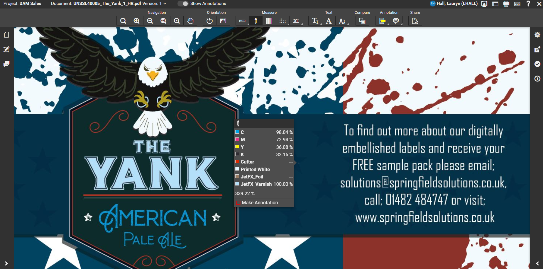
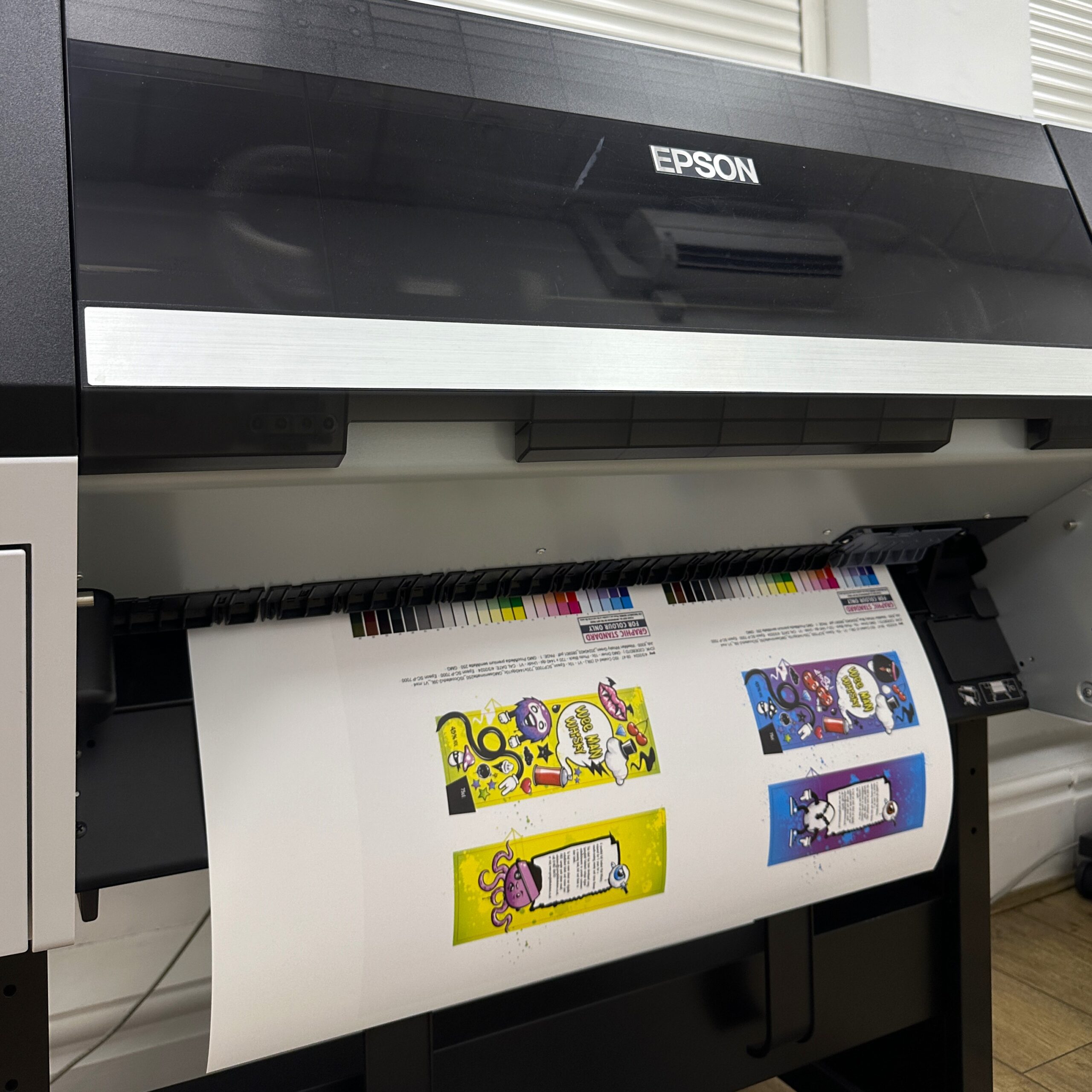
Proofing Techniques
Proofing is a vital part of the reprographics process. Digital proofs, soft proofs, and hard proofs each play a role in detecting and correcting colour issues early.
Digital proofs provide a quick and cost-effective way to check colours on screen, while hard proofs give a more accurate representation of the final printed product. Ensuring that these proofs are carefully reviewed can save time and money in the long run.
To read more about Reprographics, click here!
Precision in Design Execution: Artworking
Fundamentals of Artworking
Artworking ensures that design elements are production ready.
This process involves fine-tuning and adjusting your artwork to meet the technical requirements of printing. Proper artworking guarantees that the design you envision is what gets printed.
Layer Management
Managing layers correctly is crucial for maintaining colour integrity.
Each element of your design should be on a separate layer to avoid any colour blending issues. This approach allows for more precise control over each component of the design.
Vector vs. Raster
Understanding when to use vector graphics versus raster images can significantly impact colour consistency.
Vector graphics are scalable without losing quality, making them ideal for logos and text.
Raster images, while excellent for detailed photographs, must be used at the correct resolution to prevent pixelation and colour distortion.
Pantone Matching System (PMS)
The Pantone Matching System is an industry-standard for achieving precise colour matching, especially for spot colours.
Using PMS ensures that colours are consistent across different materials and printing processes. It is especially useful when exact colour replication is crucial, such as in brand logos and product packaging.
Colour Management: Ensuring Consistency Across Media
Colour Profiles
ICC profiles are essential tools in maintaining colour accuracy across various devices and substrates. These profiles help in standardising the colour output, ensuring that what you see on your screen matches the final printed product.
Calibration
Regular calibration of monitors, printers, and other devices involved in the design and printing process is critical. Calibrated equipment ensures that the colours are displayed and printed accurately, reducing the chances of colour discrepancies.
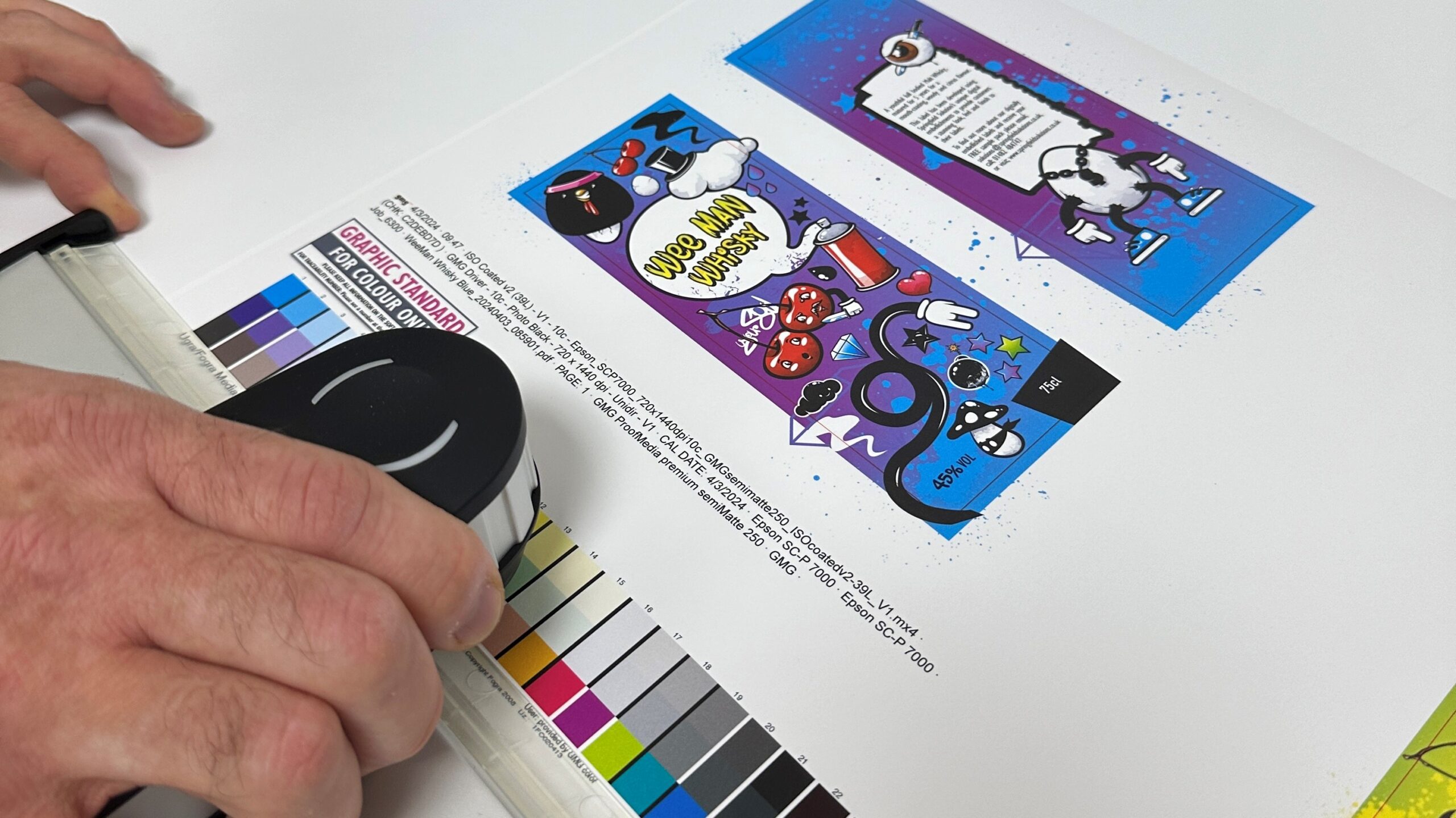
Colour Proofing
Colour proofing involves using calibrated printers and proofing systems to check the colour accuracy of your designs. This step helps in identifying and correcting any colour issues before the final print run, ensuring that the end-product meets your expectations.
The Role of Printed Proofs
Why Printed Proofs Matter
Printed proofs are indispensable in verifying colour accuracy before full-scale production. They provide a tangible representation of the final product, allowing you to check for any colour deviations and make necessary adjustments.
Types of Proofs
Contract proofs, digital proofs, and press proofs each serve different purposes.
Contract proofs are used as a final check and are signed off before the print run.
Digital proofs offer a quick and cost-effective way to check colours, while press proofs are produced on the actual press and material, providing the most accurate representation of the final product.
Approval Process
Reviewing and approving printed proofs is a critical step in the packaging process.
Ensure that all stakeholders are aligned and satisfied with the proofs before proceeding to full-scale production. This collaborative approach helps in catching any issues early, saving time and resources.
To learn how we can simplify your approval process, click here!
Achieving colour consistency in packaging is a meticulous process that involves careful attention to detail at every stage.
From reprographics and artworking to colour management and printed proofs, each step plays a crucial role in ensuring that your brand’s colours are consistent and accurate.
By implementing these best practices and working with a trusted partner with expertise in reprographics, artworking and brand management, you can create packaging that not only looks great but also reinforces your brand identity and builds consumer trust.